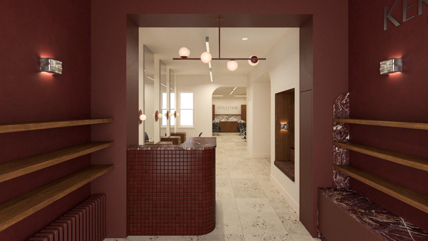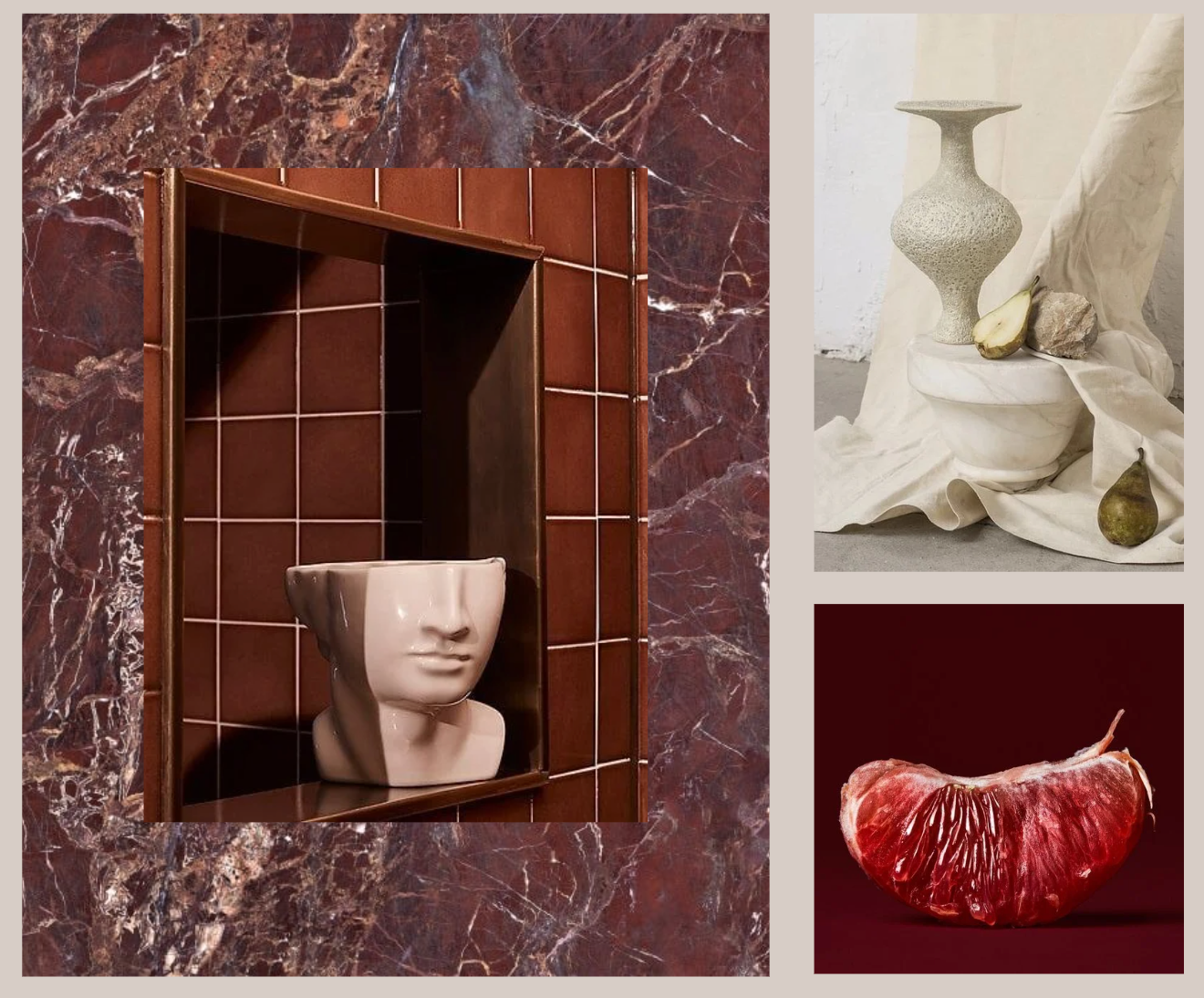
The salon design takes inspiration from rich reds, burgundy, and earthy tones, capturing the warmth and vibrancy of ripe fruit as a nod to the salon's name. The goal was to create a "cool older sister" to the original Pomme Kelowna salon - a space that feels both inviting and sophisticated.
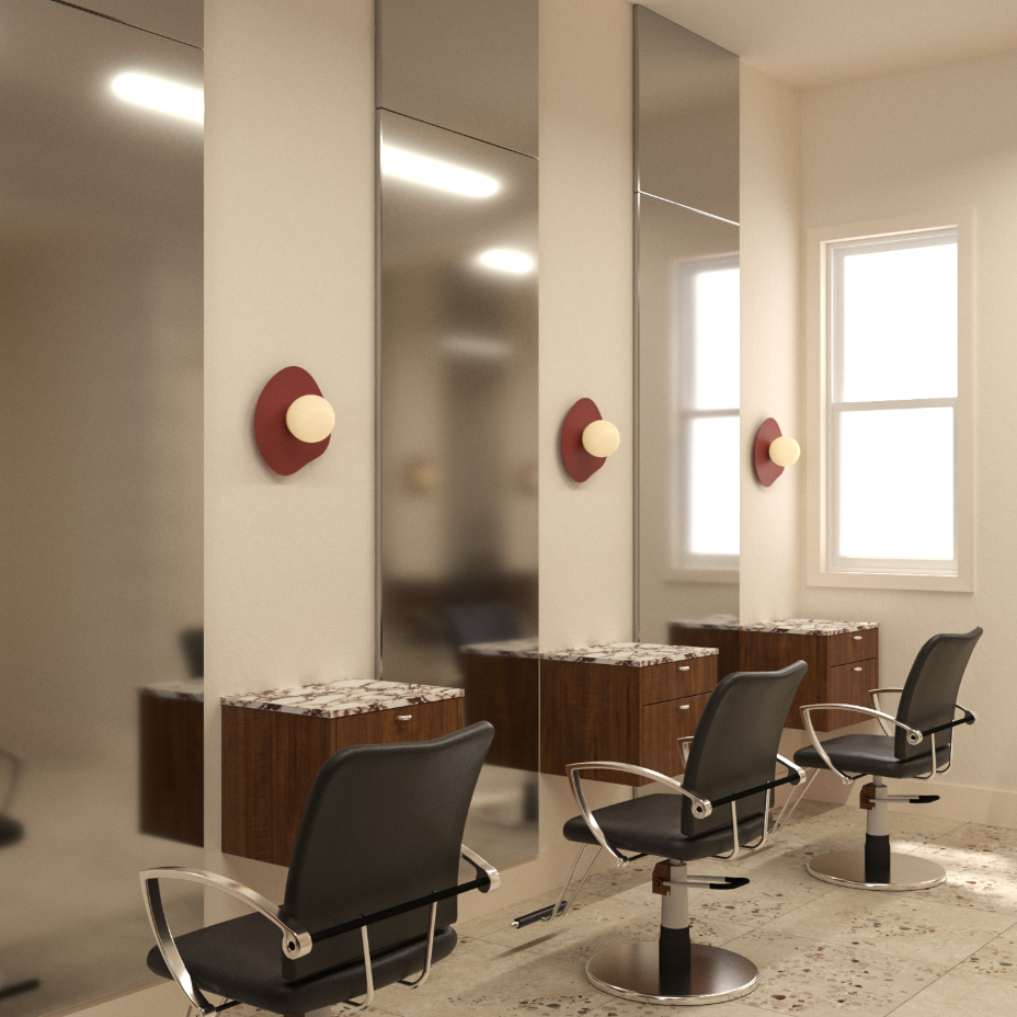
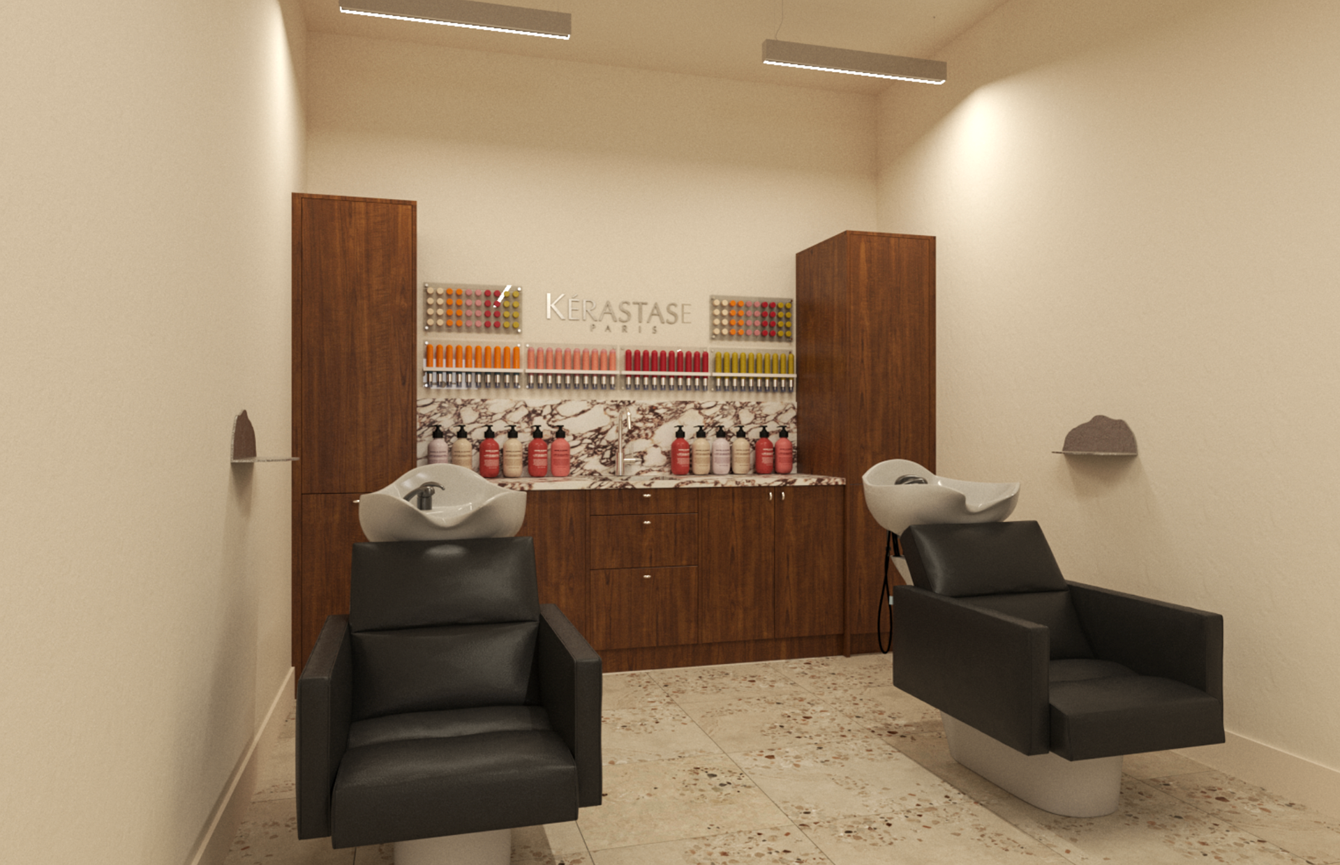
The layout distinguishes retail and salon areas, each with its own visual experience. Headers, contrasting colours, and strategic lighting define the spaces. The retail area, visible from the street, features deep red tones for a warm, inviting feel, while the private salon area is bright and open with walnut accents for contrast.
Repetitive half-arches can be found in the marble shelving and wall headers, adding architectural rhythm, echoed in the curved chrome hardware and rounded light fixtures. The material palette - burgundy glossy tiles, terrazzo flooring, chrome finishes, and walnut woods, adds depth and texture, creating a luxurious yet welcoming ambiance.
Designed in collaboration with Jillian Mann, Stay Awhile Creative.